How to Create an Image Slider in Tableau
Many people say Tableau is harder to grasp than programs like Power BI or QlikSense. But when you understand the powerful customization it offers, I think it’s well worth the steep learning curve.
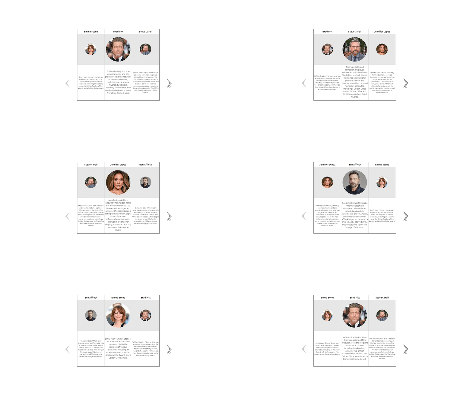
Take this dashboard, for example. I grabbed some celebrity descriptions off Wikipedia and tried to find some decent photography to accompany them. Then, using one dynamic parameter, two dashboard actions, a few clever calculations, and custom shapes, I was able to imitate the kind of website banner slider you see on most websites.
Now if you’re showing off your business or company profile, wouldn’t this be a great way to showcase your employees?
So how exactly did I do it?
The first thing you need to do is create a basic data set containing the individual’s name, a brief description, and, most importantly, their row number.
Then, you need to source good-quality images to link to each person, open Photoshop (although you could use PhotoPea online to achieve the same thing for free), and resize or crop the image to 300 x 300 pixels. It’s important your image be at least 300 x 300 pixels or more to begin with; otherwise, scaling up will result in a poor-quality image.
I suggest 300px specifically because that is the maximum dimension Tableau allows for custom Shapes; otherwise, they will be scaled down for performance reasons. The recommended size is 32px, but as we want to increase the size of the icons quite a bit in our view, I found 300px works better. A normal web resolution of 72px is perfectly fine.
In my case, I created a circular mask around the image and hid the background. You can find a brief tutorial on creating clipping masks in Photoshop here. This way, we only have the round icon without a white, square background behind it.
You’ll also need to create or source images to use as both a left arrow and a right arrow. Again, it would probably serve you well to create transparent PNG files so the white background doesn’t clash with the background colour of your dashboard.
Then you need to create a new folder within the Shapes folder of your Tableau Repository. You can call this folder whatever you want, and you can create as many as you need. By default, this folder is located in your "My Documents" folder. For example, C:\Users\[username]\Documents\My Tableau Repository. You will need to export all your images, including your arrows, into your new folder.
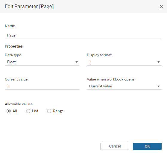
Next, create a float parameter with ‘All’ selected under ‘Allowable Values’ and set the current value to 1.
Then, create the following calculations:
Index:
INDEX()
Icon Size:
IF [Index] = 2 THEN 2 ELSE 1 END
Text Size:
IF [Page] = { FIXED : COUNTD([Employee])} AND [Row ID] = 1
THEN 2
ELSEIF [Page] = { FIXED : COUNTD([Employee])} - 1 AND [Row ID] = { FIXED : COUNTD([Employee])}
THEN 2
ELSEIF [Row ID] = [Page]+1
THEN 2
ELSE 1
END
Page Decrease:
IF [Page] = 1 THEN { FIXED : COUNTD([Employee])}
ELSE [Page]-1
END
Page Increase:
IF [Page] = { FIXED : COUNTD([Employee])} THEN 1
ELSE [Page]+1
END
Three Icon Selection:
IF [Page] = { FIXED : COUNTD([Employee])} -1
THEN [Row ID] > { FIXED : COUNTD([Employee])}-2 OR [Row ID] = 1
ELSEIF [Page] = { FIXED : COUNTD([Employee])}
THEN [Row ID] = { FIXED : COUNTD([Employee])} OR [Row ID] < 3
ELSE [Row ID] >= [Page] AND [Row ID] <= [Page]+2
END
Manual Order:
IF [Page] = { FIXED : COUNTD([Employee])} -1
THEN
IF [Row ID] = 1 THEN 1000000
ELSE [Row ID]
END
ELSEIF [Page] = { FIXED : COUNTD([Employee])}
THEN
IF [Row ID] = 1 THEN 1000000
ELSEIF [Row ID] = 2 THEN 2000000
ELSE [Row ID]
END
ELSE [Row ID]
END
For all views you create, you’ll need to set them to “Entire View”.
For the first view, drag “Manual Order” onto columns and hide the header, followed by whichever field represents the person’s name (in my case, it was “Employee”, even though I’m featuring celebrities).
Switch the chart type to Shape and drag a copy of “Employee” or whatever your equivalent field is called onto the Shape icon. Add “Icon Size” to Size and edit the thresholds according to your preferences. If you don’t see the Size legend, go to Analysis > Legends > Size Legend to bring up the control window. Make sure “Icon Size” is computed using “Table (across)”.
Navigate to your custom set of shapes and link each person to the relevant image. You will need to cycle through the “Page” parameter in order to assign an image to all available data points, as the view is set up only to show 3 at any given time.
If your custom shapes do not show up in Tableau after saving them to the appropriate folder, you can select “Reload Shapes” to refresh the list.
The way “Manual Order” works is that it considers how many unique employees or individuals there are in the dataset and assumes you’re always going to be presenting them three at a time. Using that logic, it works out that on the last page, you would see both the last two employees in the dataset as well as the first employee as the cycle restarts.
When this happens, Tableau will naturally shift the first employee (according to the “Row ID") to the left of the other two. But in a traditional slider or banner, the first employee would appear after the last employee in the order.
So we state that in this scenario, if the employee’s “Row ID” = 1, make it “1000000” or some other ridiculous number, so that Tableau will display it after the other two, whose “Row ID” will be much lower.
It performs a similar calculation on the very last page, where only the last employee is shown alongside the first two employees in the rotation.
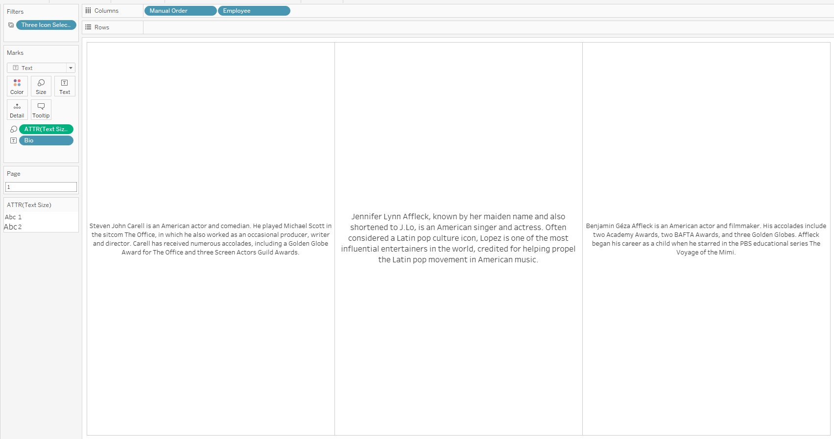
Now, create a new tab for the bios and add both “Manual Order” and “Employee” to columns, hiding both headers.
Place the field representing the person’s description (mine is called “Bio” in this case) onto Text and place “Text Size” onto Size. Switch it to ATTR() instead of the default aggregation. You can adjust your size thresholds again using the Size Legend.
You may be wondering why I don’t just use “Icon Size” here. For whatever reason, Tableau ignores the Table Calculation when using a plain Text chart that also contains columns.
As a workaround, I had to link “Page” to “Row ID” by stating that if it was the last page in the slider and “Row ID” = 1, their size should be bigger because they would be in the middle. Likewise, if it was the second last page and “Row ID” equalled whatever represented the final “Employee” in the data set order, then their size should be bigger as they would also be in the middle. Finally, if “Row ID” corresponded to “Page”+1, that would represent the middle image and therefore should also be bigger. Otherwise, anything else should have a smaller size.
Finally, place “Three Icon Selection” on the Filters shelf and select “True”. Make sure to apply it to the previous view we created as well.
Create an additional view to serve as the left arrow. Switch the chart type to Shape and double-click in the blank area below the Marks cards to populate a text entry field. Type in “0” and hit enter. Convert the value to discrete and drag it onto the Shape card. Add “Page Decrease” to Detail and set the Shape icon to the relevant arrow from your Custom Shapes.
Repeat the process with a new view, but select the opposite arrow for the Shape and use “Page Increase” this time.
Finally, we can create the dashboard.
Add a horizontal container and place both arrow views inside, each facing the right way. Then place a vertical container in the centre and place both the icon and text box sliders on top of each other.
To better align the arrows, either increase padding near the top or add in vertical containers for each, placing both an arrow and a blank element inside and resizing accordingly.
If you prefer, you can follow the layout outlined in the Item Hierarchy under the “Layout” tab, using our Tableau Public workbook at the bottom of this article.
The very last step is to go to Dashboard > Actions > Add Action > Change Parameter.
Name it something like “Decrease Page Number” and select the sheet with the left-facing arrow from the list of Source Sheets. Set “Run action on” to “Select”, set “Target Parameter” to “Page”, and set “Source Field” to “Page Decrease”. Switch aggregation to “None” and leave the final setting on “Keep current value”.
Follow a similar process for the opposite arrow.
If you wanted your banner to feature a different number of images at a time, say 5, your calculations would need to be adjusted accordingly. But the good news is... it can still be done!
With all that, you should now have a working slider! Simply format the rest as you see fit.


